Designers talking about Farrow & Ball sound like my late, fervently Catholic maiden aunt talking about the Pope.
The reverence. The awe. The unquestioning devotion.
Farrow & Ball, for those of you who haven’t been looking at design magazines for awhile (that was me, up to last year) is an English company that makes paint. They also make wallpaper, but it seems it’s the paint that gets the most attention.
Many of the paint names are cheerfully gross, as if inspired by the long list of satirical British comedy troupes from Beyond the Fringe to Monty Python’s Flying Circus. Dead Salmon. Mole’s Breath. Sulking Room Pink. Arsenic. Calamine. Elephant’s Breath. Others names are plain and to the point, such as Light Blue, Light Grey, Off Black, Green Blue.
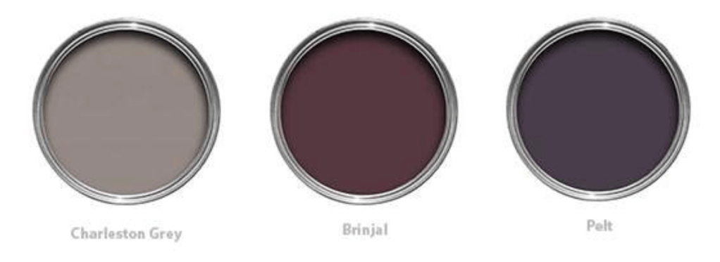
The first designer we hired when we were struggling with the decision to move our kitchen to a different room had a simple brief: she toured the house and then provided us with a written note with recommendations on the kitchen location. But she couldn’t resist sharing the F&B love. She (like me) was not enamoured of the barn door in the house but suggested a way to transform it through colour: “I would paint the door to complement the rest of the main floor. The colours Brinjal or Pelt from Farrow and Ball are rich, beautiful colours and I think they would complement your main floor.” She also suggested painting the hallway “a colour like Charleston Grey” and inserted this illustration into her note:
This same designer has done some amazing rooms featuring Farrow & Ball: the main reason we only hired her for a couple hours of her time was that she had whole-home makeovers booked for a year or more ahead after House & Home magazine featured one of her transformations. I’ve seen this place in person (with F&B Smoke Green paint on the kitchen cabinetry and crown moulding) and the effect is stunning.
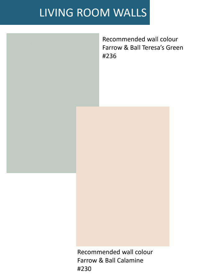
The second designer we hired for a colour consultation created a document with suggestions on paint, fabric and accents; most of the recommended paints were Farrow & Ball. It started with Farrow & Ball Black Blue to replace the purple on the front door (which I had no intention of changing). The living room (back then, still mapped to be in the Problem Child room) had two suggested colour schemes, one with Farrow & Ball Calamine for the walls, and the other with Farrow & Ball Teresa’s Green. The first of these is a pink paint named, yes, after the anti-itch lotion. The company states that “a light touch of grey prevents this subtle pink from being too sugary, giving a much fresher finish.” The final F&B colour she selected was India Yellow as the paint colour for the kitchen island. Here’s the description, exclamation mark included, from the company: “This deep mustard yellow is famously named after the pigment collected from the urine of cows fed on a special diet of mango leaves!”
I knew I wasn’t going for that green for the walls but I thought I’d get sample pots of the Calamine and India Yellow. I still envisioned some tone of teal being a good fit for the house and its teak furniture so also picked up Vardo, described as “a rich teal (that) takes its name from highly decorated traditional horse-drawn Romany wagons.” You can get samples through mail order, but we were living in Toronto then and I had a work event one day on Yonge Street in the same Summerhill neighbourhood as Toronto’s Farrow & Ball retail store.
The staff person was lovely and walked me through the range of finishes and the recommendations the company, which manufactures all its paints in Dorset, England, makes about primer: it’s not one size fits all. You use White & Light Tones, Mid Tones, Red & Warm Tones, or Dark Tones primer, depending on the colour of your paint. He recommended getting a pack of foam boards and add the sample paints to those: a good idea as you can prop them up around a room.
The sample paints come in a finish the company calls Estate Emulsion. It is the dullest paint finish I’ve ever seen, and I found it hard to get an even coat; maybe I didn’t shake it up vigorously enough before applying. The company says that Estate Emulsion “with its distinctive chalky matt finish minimises imperfections, and scatters light to fully express the depth of our colours. The flat, velvety effect it creates even brings added richness to darker colours.”
Neither the Calamine nor India Yellow appealed to me once on their sample boards, and the Vardo sample felt too dark. I did find another F&B colour, a light aqua called Green Blue, that went into the “to consider” pile. Eventually, we chose this colour for the cabinetry panelling around our kitchen fan to complement the main teal tone we chose, a Benjamin Moore shade called Harbour Side Blue, that we’re using on selected walls and on the island. Alas, our “Green Blue” is a Farrow & Ball colour look-alike only: the cabinetry company we hired uses a different paint formulation for spray painting cabinets.
There are many brands of paint out there: big U.S.-founded lines such as Sherwin Williams, Benjamin Moore and Dulux as well as Canadian-founded lines such as Para Paints and Beauti-Tone. Farrow & Ball is pricer than any of them, even though it scores a “meh” 62 in Consumer Reports review of interior paints.
So: why pay more? My favourite take comes from a 2019 New Yorker article, “The luxury paint company causing a new kind of decorating anxiety.”
“Among devotees, Farrow & Ball paint is believed to offer an unparalleled depth of color and a capacity for subtle, handsome transformation under different light conditions. For homeowners who lack the visual discernment to appreciate the way their Mizzled kitchen cabinets turn from gray to green between sunrise and sunset, reassurance can be found in the product’s premium price. Farrow & Ball paints cost about a hundred and ten dollars per gallon — almost twice the price of an ordinary brand. Using the paint confirms both a customer’s fashion sense and financial means. It’s like a designer handbag for your house.”

Ah ha! Thank you for explaining the Farrow & Ball craze. Someone recently told me with some reverence that they had had their home painted in Farrow & Ball and I wondered why in such an off-handed comment they were providing that level of detail. Now that you have explained the cult status, I understand. $110-dollar-a-gallon paint is something to talk about!
LikeLike
My, My A little rich for my blood. You will make the right decision. Good luck.
LikeLike