It turns out that an overwatered plant is the root of our renovation colour scheme.
As I wrote in a previous blog entry, Peak teak, we discovered that the blue tone kissed by green known as teal, turquoise, or aqua goes well with teak wood. So there was one colour for the mood board.
The previous owners of our Stratford house had chosen a rich, deep purple for the front door. When we took possession of the house, we repainted what had been a Granny-apple-green front foyer and stairwell with one accent wall of the same royal purple and the rest in a paler lilac tone.
So what goes with a purple entrance, and turquoise bits beyond?
I set up an online consultation with a designer known for using lots of colour in her schemes: no beige-ivory-grey neutral havens in her portfolio. Her recommendations came in the form of a digital document and a gift-wrapped box of wallpaper and fabric swatches.
The design she envisioned worked together, as one expects from an expert, but much of it didn’t feel right for me.
Still, if I thought of myself as a hitchhiker on Renovation Road, her ride got me closer to my destination.
I knew we were going to have white, with turquoise and touches of farmhouse black metal. There was that purple and lilac hall that needed to fit in (or else change). The old house also has a couple windows with stained glass — cobalt blue, a bit of pink, a bit of yellow.
So added to the palette: Accents of pink, orange, yellow. A pale, light version of the signature teal.
I’ve never used wallpaper in my life, a reaction perhaps to childhood overexposure: my mother loved flocked wallpaper and used it liberally. When I set up my own living spaces, I chose wallpaper free. But through my designer consultation, and internet sleuthing, I became intrigued with wallpaper colour and design. Lord Twig. Kristy Stafford. Pierre Frey — all names I had never heard of, before.
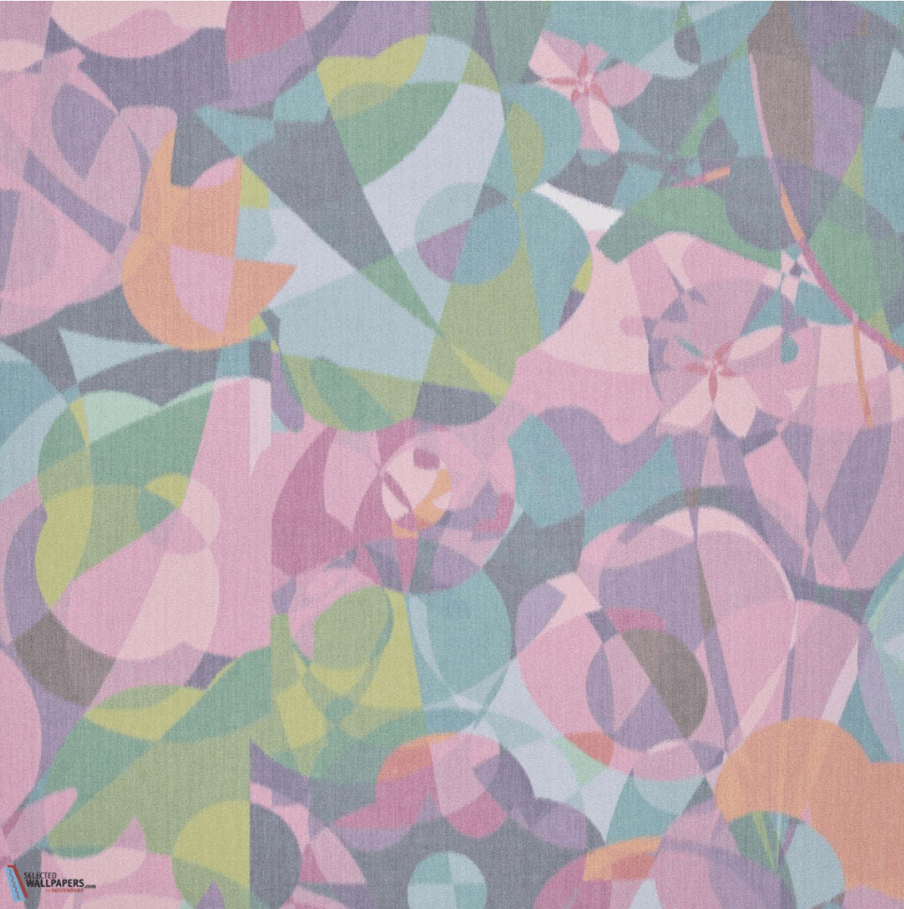
I fell in love with one pattern in particular: Ken’s Kaleidescope, by Pierre Frey, a swanky design company based in France.

As a bonus, “Ken” is my partner’s father’s name.
I hope to use this as an accent in the hall as a voluptuous welcome to the design colour scheme, although I don’t have a price quote on it yet and I fear it could be beyond even my stretch-on-my-tippy-toes budget. We’ll see if this comes to pass.
As we packed up our Toronto apartment in the fall, one day I emptied a small bookcase that always had a cloth runner on its hip-height top: that particleboard top was bubbled and damaged from water that seeped one time from a plant pot. My favourite cloth runner to cover the bookcase top came from Spruce Toronto, a gift and decor shop in the Cabbagetown neighbourhood where we lived. As I folded up that runner to pack it away, I took a closer look at it.
White. Turquoise. Pale-pale turquoise. Yellow. Orange. Pink.
Unconsciously, I was building our new house palette inspired by that runner.
We were, at this time, looking for upholstery fabrics. Some from the gift-wrapped designer box seemed promising and my final selection for sofa cushions turned out to be (deep breath) $379 U.S. a yard. A budget buster. I took a picture of the runner fabric, sent it to the owner of Spruce Toronto, and asked her if she remembered having it in stock.
She quickly replied that, yes, that was custom fabric created by Toronto designer Avril Loreti and she provided Avril’s contact information. After some back and forth, Avril is getting another run of this fabric made — its name is Hundreds of Millions — and we’ll get all the custom fabric we need for cushions, shipping included, for less than a yard from the American designer.
Balancing out these big pops of colour will be a lot of white and pale flooring.
These certainly aren’t ripped-from-design-magazines colour choices, which in 2022 seemed obsessed with grey. But they’ve been bringing a smile to my face for years — and I hope they’ll keep bringing those smiles for many more years to come.
I love that you are stepping outside the norm and being dramatic!
LikeLike